YouTube Kids Illustrations
Rich Kid-Centric Characters Who Are Relatable and Animatable
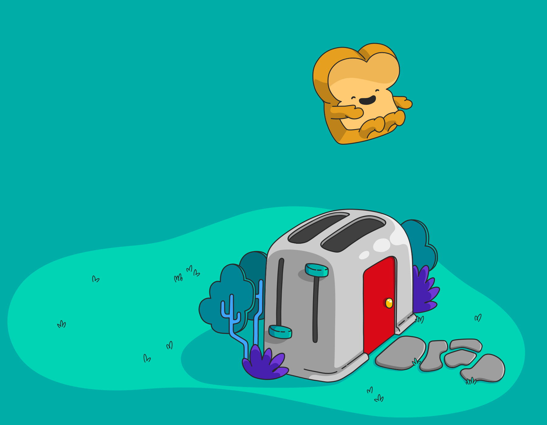
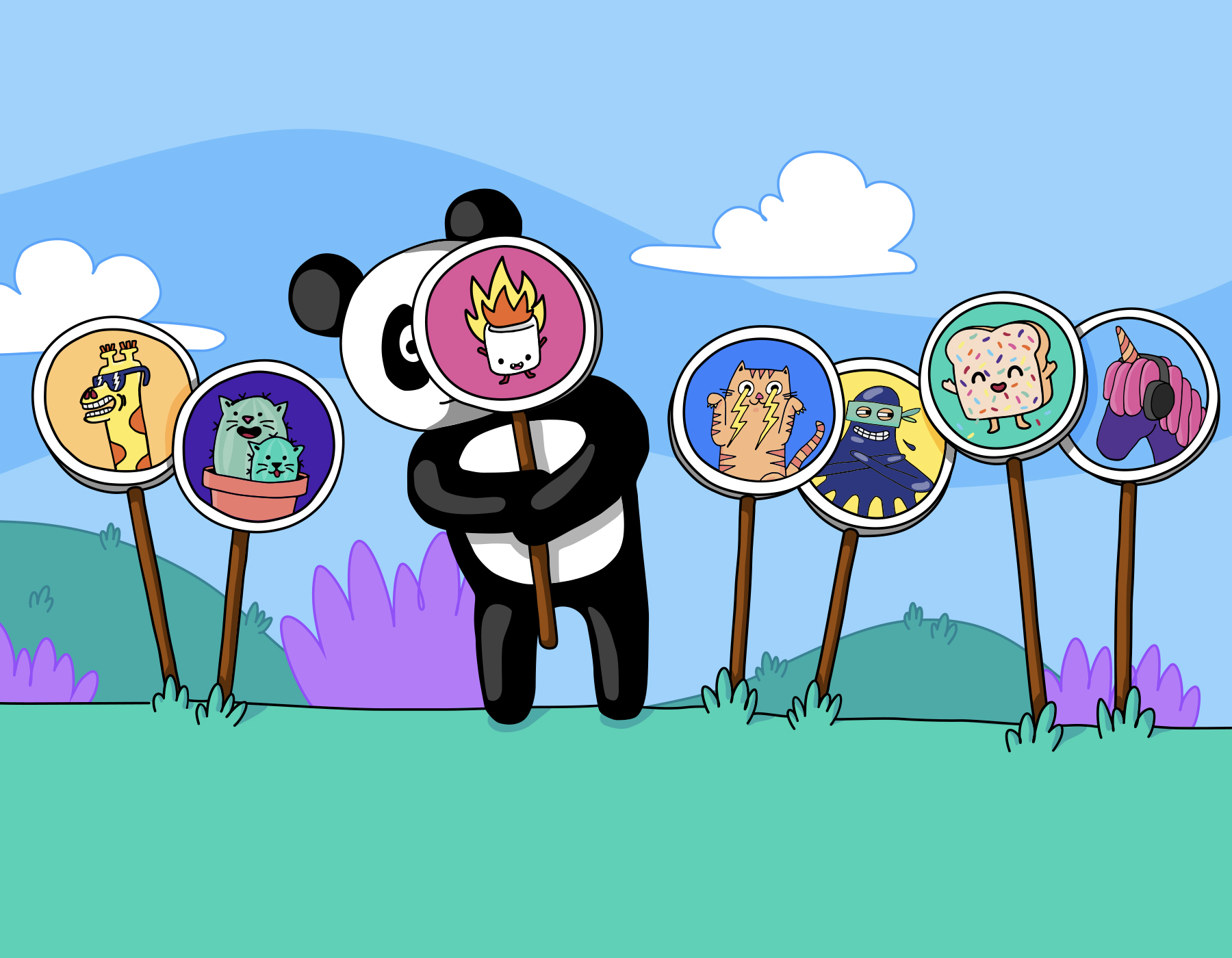
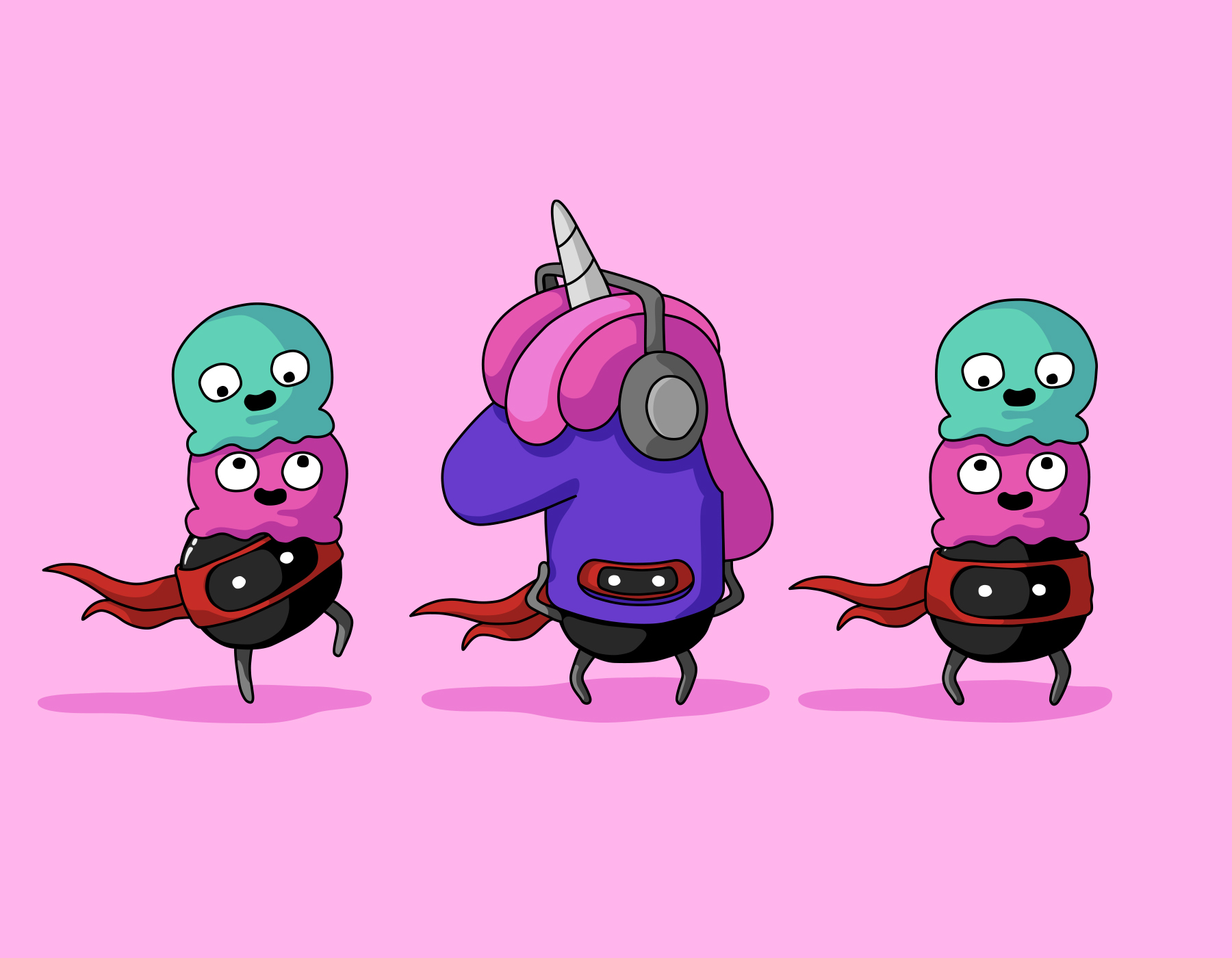
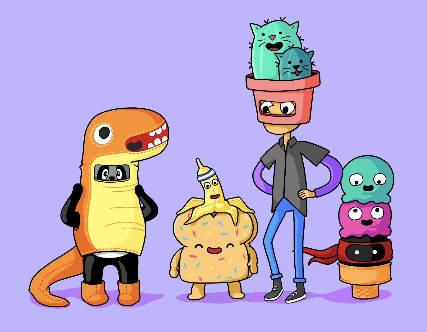
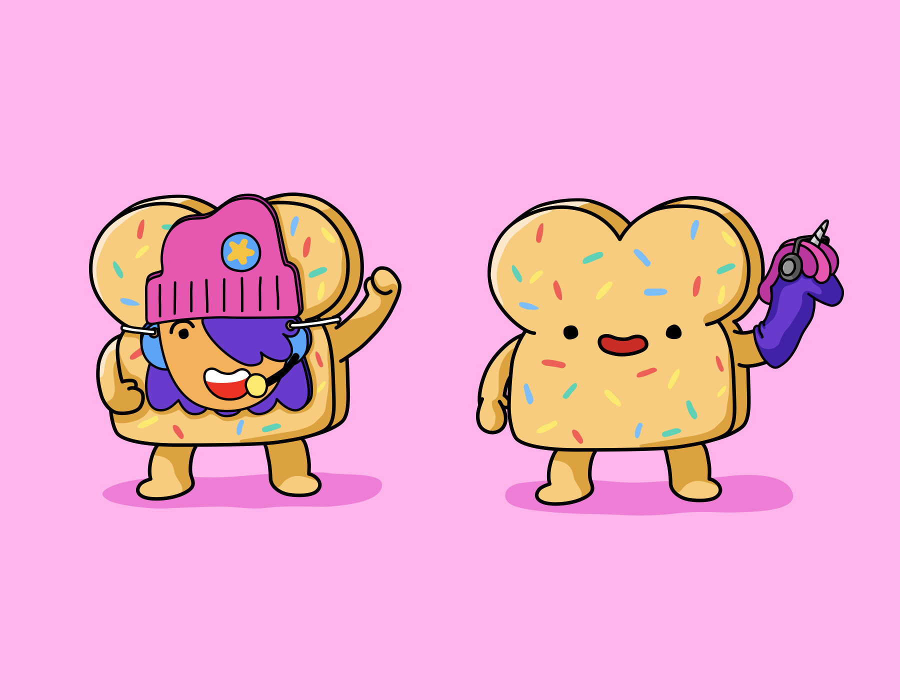
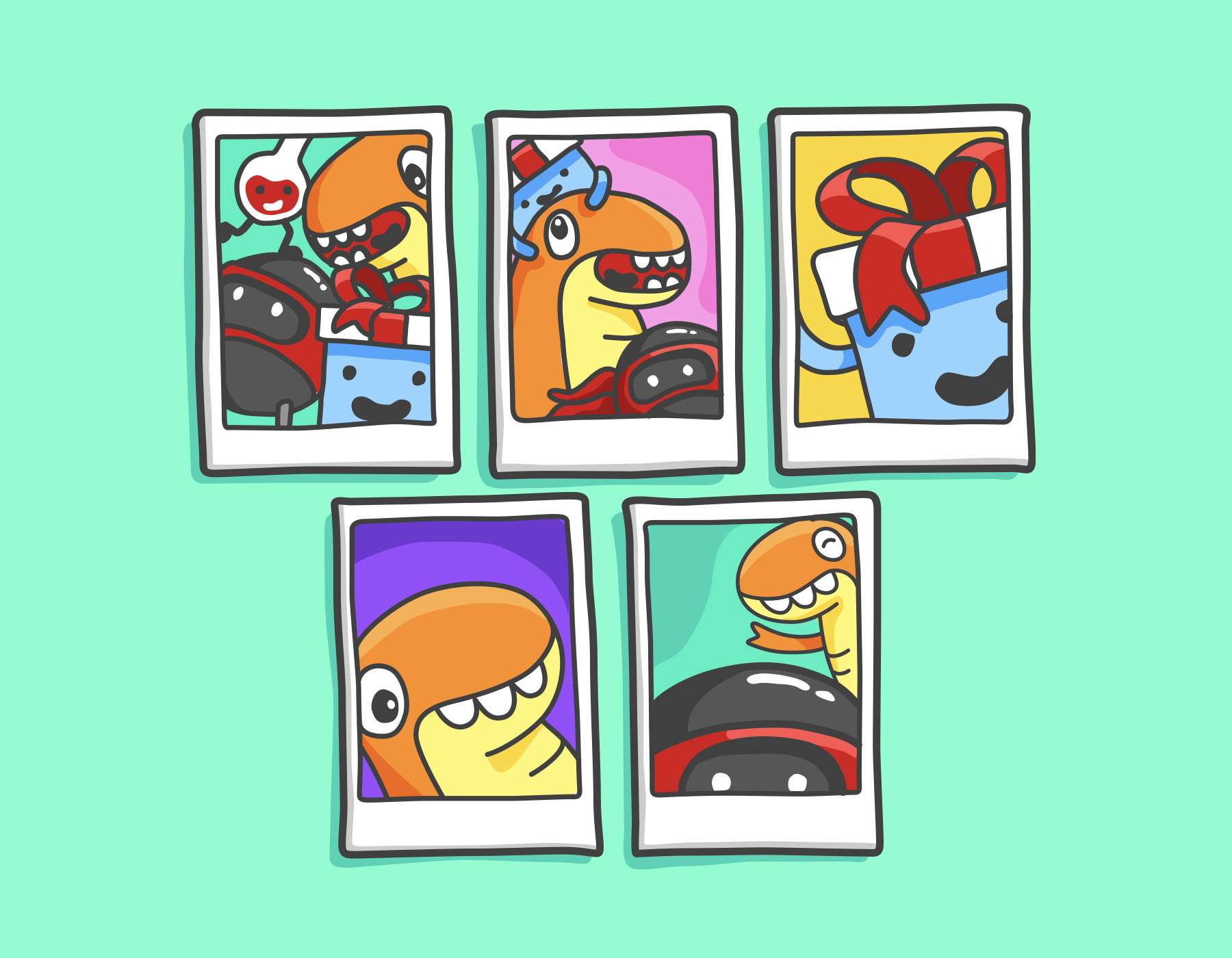
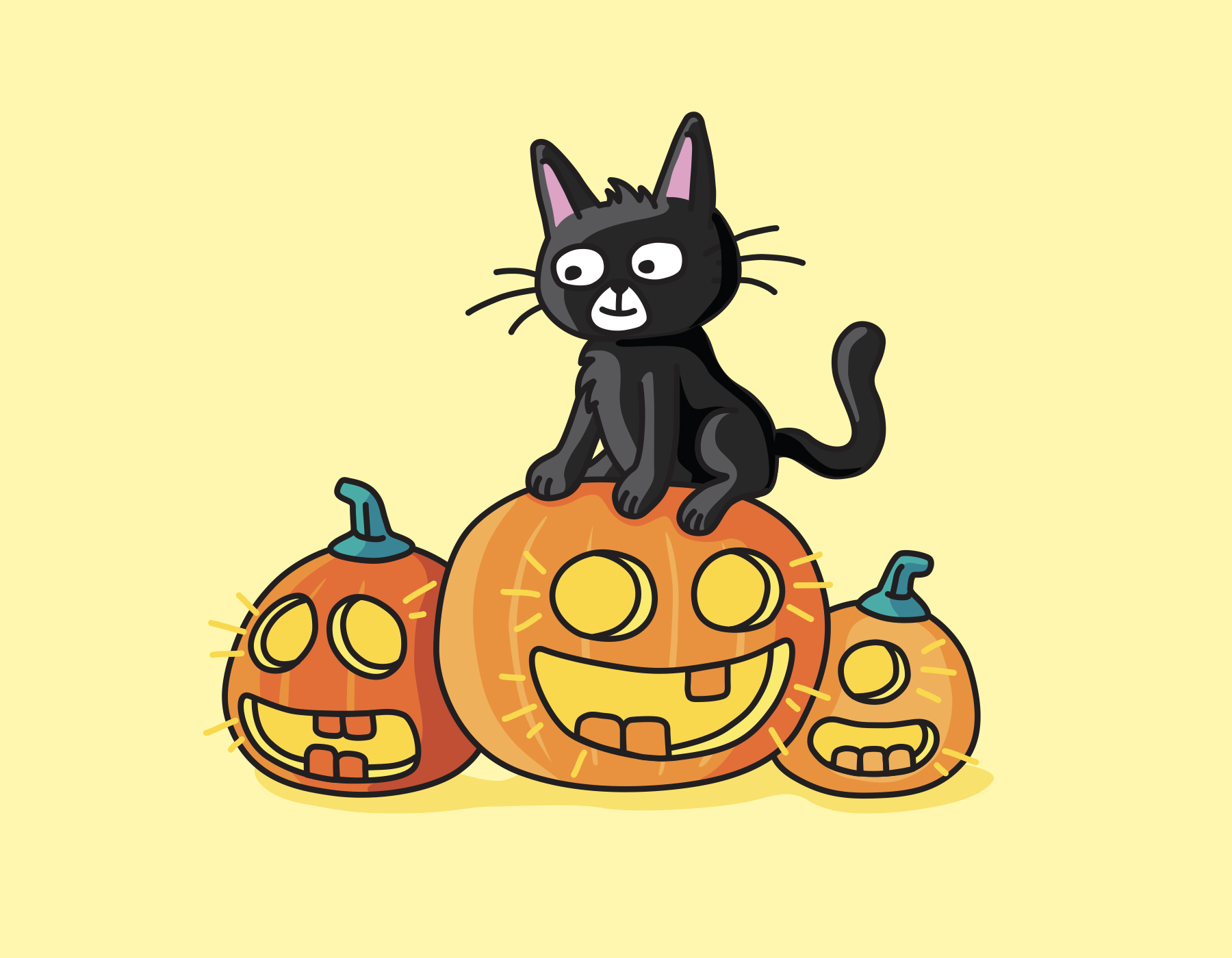
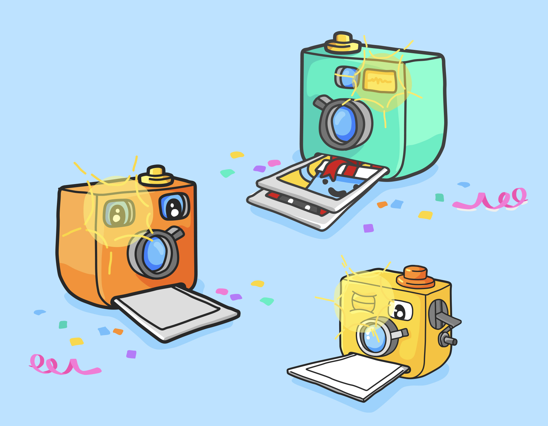
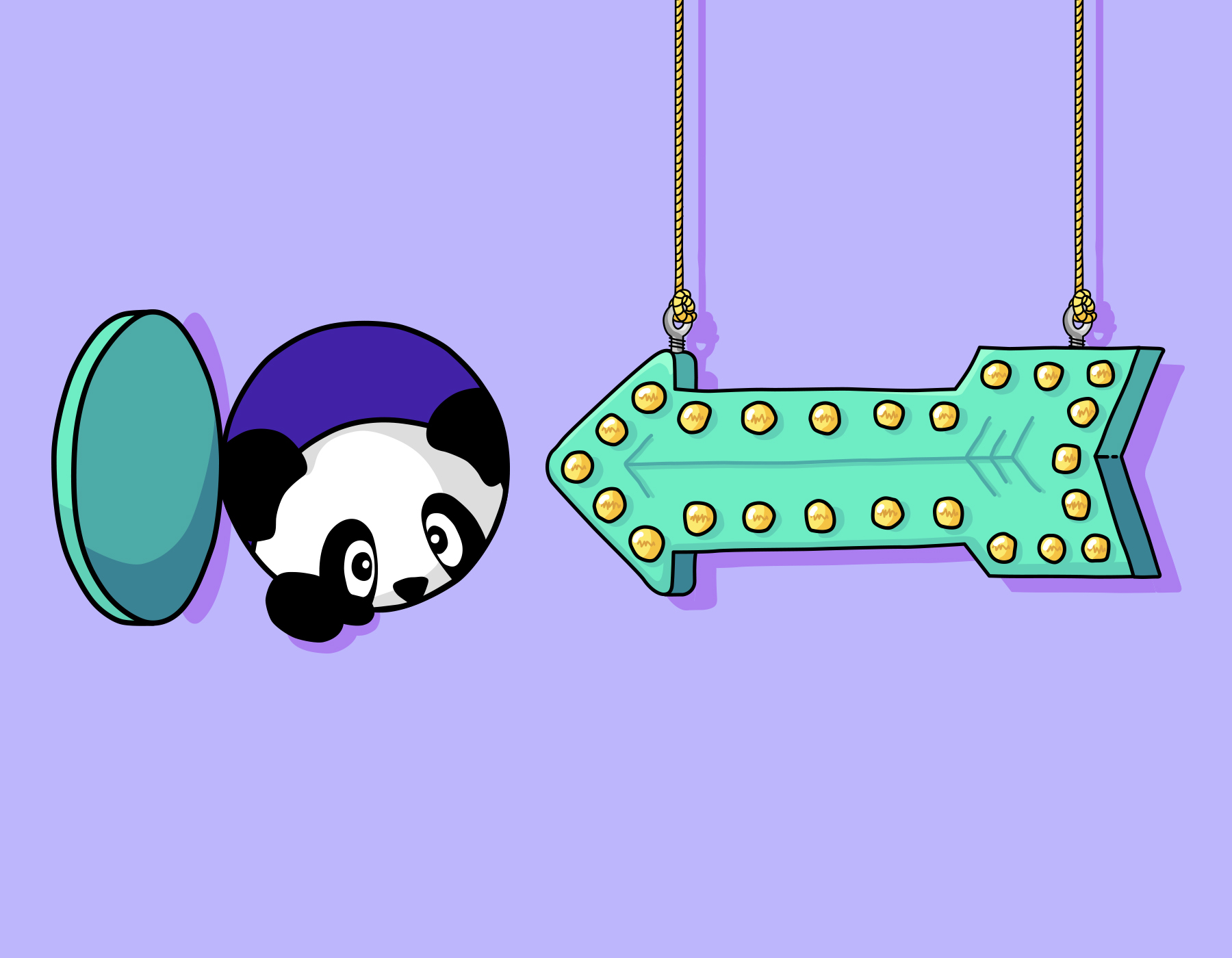
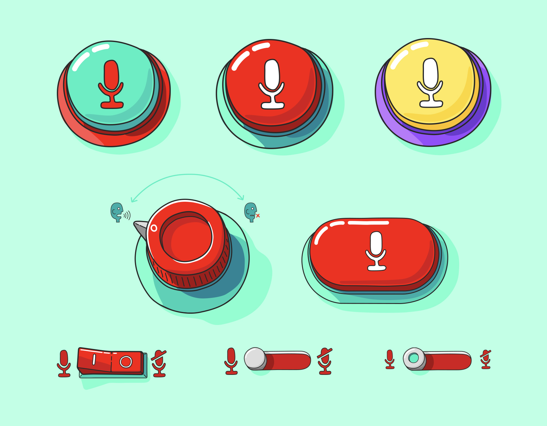
When we rebranded YouTube Kids, it was a consensus that we wanted a richer styling of the world we were building. Our desires were to draw in older kids and make the app feel more mature and delightful. Our lead Illustrator came up with a toolbox that hit the mark and pushed the app to new levels. One of the downsides of his approach is that his style was too organic and hand-drawn, which made mobile implementation heavy and animation very difficult, even with Lottie. As I took the toolbox to implement into different features we were building, I began to soften the hand-drawn look and bring it closer to a cleaner vector approach. These illustrations are examples of that sweet spot that allowed me to, much more easily, get more visually rich spots within the app, but also animate many of them without causing major performance issues.
