YouTube Kids Voice Search
Making Search Voice-Centric, Inviting, Comprehensible and Fun for Kids
Searching is one of the most difficult interactions to design for kids because of its inherently complex nature and the need to build something that is straightforward enough for users who may not be able to even read yet. I worked closely with a colleague to rebuild how search worked in YouTube Kids and how to build the experience around a fun story our users could connect with and understand.
Mission
Build a new voice-first search experience, through strong story telling, delightfully rich visuals, a playful soundscape and a loveable character, so users could enjoy hunting down the content they are interested in within an environment intuitive enough for preschoolers to use.
Goals
- Redesign the YouTube Kids search experience to be visually richer, more powerful and more enaging
- Create a visually rich world that would draw kids in and make them feel like they were in a different area of the app
- Create an audio brand to accompany the visual brand to build an immersive interaction
- Make it playful and enjoyable so it becomes a favorite feature of users
- Create a character who's role would become a guide to finding content
- Create a strong backstory to steer the direction of illustrated and branded assets
- Utilize TTS engineering to give auditoray feedback to users who are not yet able to read
Target Audience
Children who are 3 - 9 age range including users who are incapable of, or struggle with, reading and writing.
Initial Brainstorming Phase
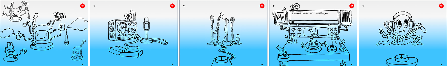
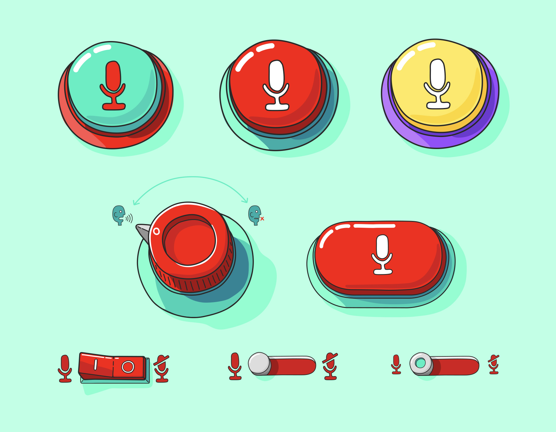
I tried to get really cerebral around the idea of searching and wanted to explore a wide variety of options. It was important to build the interactions around a story to help drive the brand and create strong boundaries from which the designs can be built within. It is often exhausting and time consuming to take a 'sky's the limit' approach when rebuilding a feature, so brainstorming was the time to gather a handful of strong ideas/storylines to explore so I could begin crafting some rough wireframed interactions. Below was my first pass at brainstorming. The ideas I considered were a robot assistant who takes different forms depending on the interaction, a couple visual expamples of a skeumorphic approach of how the app is capturing the users' input, a crazy contraption with loads of feedback dials combined with a few of our branded characters and, lastly, one of our branded characters who would work as assistant helping our users find what they need.
Two Heads Are Better Than One
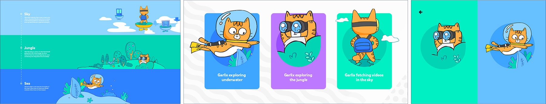
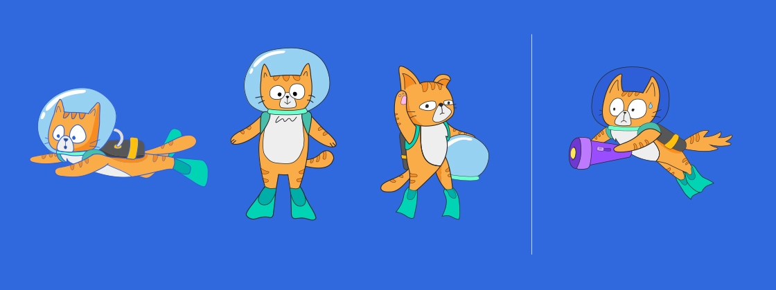
While I was working on the ideas above, my colleague was taking a more designed approach to the experience. She was working around the idea of voice search having different modes or phases. We had been throwing around the idea of using one of YouTube Kids' lesser known branded characters (an orange adventure cat) as a helper who would go to any length to help a kid find what they were looking for. That line of thinking became the basis of this exploratory direction.
Where Our Commonalities Intersected
As my colleague and I were exploring our different initial ideas there was an interesting intersection of our two different approachs. Some of my more simplified concepts were around utilizing procedurally generated elements to convey the idea that the sound of people speaking is, from a scientific perspective, waves. I was considering how this information could be useful to our younger users. How could we teach a little science and make it clear to kids that when they speak, YouTube Kids hears them. My colleague had gone down the same route. She had worked through an exmaple of the branded cat character in some water and considered the direction of the waves being somehow connected to auditory input. Thus the idea that YouTube is an ocean of content and we want to keep our users in the reef was born.
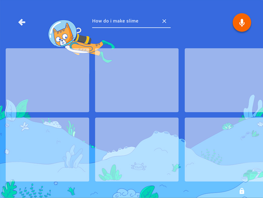
Hunter the Cat in an Ocean of Content
After deciding to utilize the ocean theme, we began formulating a story. The story centered around the concept that YouTube is like an endless ocean of content. Much like the ocean, there are parts of YouTube that are dark and scary, especially for younger vieweres. We began to build on the idea that our users were going to be kept inside the reef where all the fun and safe experiences reside. There is plenty of amazing things to do within the reef, but since it's still an expansive area we needed a guide. After agreeing to use our thrill-seeking, adventure cat, we worked on giving him the name Hunter. His main desire was to go out searching the most remote edges of the reef to find what a user is looking for. After building out the story, my colleague took an initial shot at Hunter's illustration style.
Background and Elements
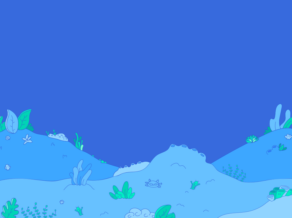
Next steps were to build out an environment. My colleague worked through some ideas around simple coral designs to fill in the experience and make it feel more immersive. The vector assets were brought into After Effects and turned into JSONs for optimized workflow. I explored illustrations of buttons to see how the main interaction could be.
Building Our Ocean World
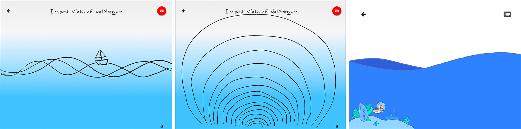
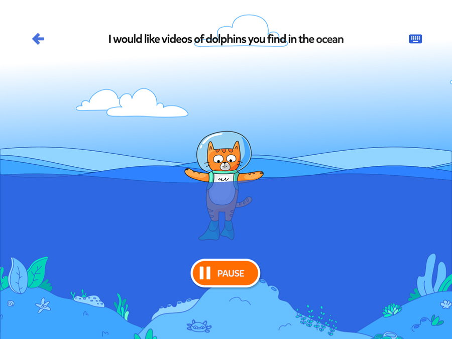
After all the pieces were built and tweaked, we began laying out designs to see how the world fit together. I added clouds and sky to Hunter, the waves, and coral. The waves were to be porcedurally genearted in code, interacting with kids' voices as they told Hunter what he was to go searching for. In that initial state, he resided above the reef, treading water and waiting for his moment to dive. When a successful input was received, he would dive down, the water would animate upwards covering the whole screen and the reef would rise up dropping us into a world of the content that Hunter would be searching through. He would then reappear swimming back and forth while searching.
Building Delightful Animations to Draw Kids Towards Action
One of the key aspects to this entire redesign working was an engineering workflow that was robust enough to make it feel immersive as well as some super fun animations to draw kids in and make them smile. Leaning on the workflow I had built around onboarding, takeovers, navigation and loading in YouTube Kids, I was able to create a bunch of really fun animations of Hunter in different states. These assets were created in After Effects and animated at 60fps. They were exported as JSONs and rendered using the Lottie animation library for mobile and web. While keeping relatively small file sizes, and reasonable performance, we shipped fully vector animations that were implemented cross-platform utilizing a single JSON file per animation.
Illustration Exploration for Error Screen Interaction
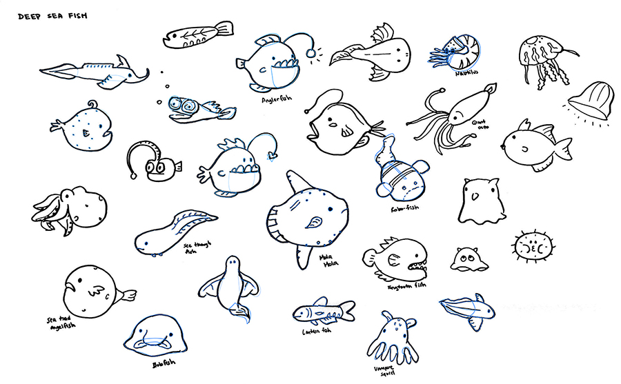
After I had such incredible success creating delightful animations for the redesigned experience, my colleague and I worked towards creating a really fun moment for one of our error screens. Within the story of YouTube Kids being the reef, in an ocean of content, we wanted to convey the dangers of what happens when you get out past the reef. My colleague took a pass at creating some illustrated creatures that you may see in the deeper, darker parts of the ocean. There are some great characters here from trigger fish to jelly fish, eels to weird fish that will glow in the darker depths. After working through these initial sketches, final illustrations were created that I imported into After Effects to bring all the pieces together.
Warning Kids to Head Back
Once the illustrated fish assets were finished, I paired them with Hunter to create a really fun, fullscreen experience for kids when they are looking for something they shouldn't be. I gave him a flashlight and a freaked out expression to indicate that he's not comfortable out there. I then animated fish in and out of the frame to fill out the story and make it more interesting. Creating an experience like this was so much fun and a really cool way to see how far we could take animation and interactions within the YouTube Kids app. I did have to be selective in the illustrations I used and how many parts were animated because of fize size and performance. This JSON weighed in at around 1.2MB and struggled to play on some of the oldest devices we tested. As devices get more powerful, this will be a really fun area to push even further because of how elaborate you can make the interactions.
Wrapping Everything Up With Delightful Audio Branding
The final aspect I tackled during the entire redesign process was building audio branding elements that were similar to the primary YouTube Kids audio brand, but were fashioned specifically for this area of the app. If the goal is to build an immersive experience, pairing delightful animations and interactions with silence just doesn't sell the experience. At YouTube Kids I had made audio brand a priority and worked extensively, with an agency in New York, to build out a library of sound elements to be used in all apsects of the app and marketing areas, to reinforce the world that was developed visually. Since the voice search area was meant to feel like it's own little world within the app, utilizing audio brand to reinforce that experience was vital. Below are the different background loops used for different moments of the overall experience.