YouTube Kids Takeovers
Drawing Kids in With Focused Content and Visual Themes
One of the differences of kids on the YouTube platform is that we were not as interested in getting kids to spiral down a rabbit hole and rewatch their favorite stuff over and over again. As we built our viewing experience, we needed to find ways to bring kids back and push them to explore content they hadn't seen before. Monthly takeovers were a way for us to help solve this.
Mission
Draw users in with focused content around specific themes for a set period of time in order to help them broaden their interests and explore, possibly untapped, areas of content that would hot have, otherwise, been surfaced in their recommendations.
Goals
- Make enough visual changes in the app to signal to the users that something is different
- Give users a reason to come back to the app if they feel they've exhausted the library of content
- Help users find content they may not have been looking for to begin with
- Create an audio brand to accompany the visual brand to build an immersive interaction
- Use the thematic moments to flesh out more backstory and personalities of key branded characters
- Build a delivery system for all assets in such a way that it is not a heavy time request of engineering team while providing a digital delivery system in order to circumvent the really long app store approval procees
Target Audience
All users of the app who are looking for content to watch and untapped areas to explore. An equal importance applied to kids who are a fan of that month's theme as well as kids who may be unaware of the specific content being featured.
Leading With a Splash Screen
When I first started at YouTube Kids, it was very important to me to continue changing the visual space that was available directly after the application launched. I always positioned that piece of real estate, within the app, as one of the most valuable areas for brand reinforcement. I often talked about how much advertisers would pay to have access to a space that was so front and center, that every time the app was launched, millions of kids, around the world, would see it first thing. Because of our philosophy in YouTube Kids, we would have never sold this space to advertisers, but that doesn't mean it's any less valuable for the YouTube Kids brand. I decided this would be the ideal space for attract loops for the kids to be showcased. When I began building takeover assets, this was the area that I felt was the most important to signal to users that something is different, sparking their curiosity so that they may begin searching around to see what else has changed. This bit of psychology is very important in the driving factors of rebrands, redesigns and much of the constant UX tweaking that can happen in the life of an app. Users love to see new stuff. In the two examples below I worked with an Illustrator to brainstorm concepts that I turned into storyboards, animated, added sound brand and exported for in app implementation.
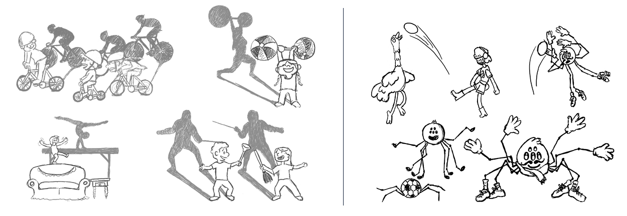
Rebranded Look Paves the Way for More Illustrative Style
Most of the earlier assets shown were based around very simplistic illustration styles, geometric constructions and generic kid-based characters. Halfway through the life of YouTube Kids, the app was rebranded to try and draw in more users appraching the tweenage years. Because of the desire to draw those more mature minds in, the illustration style became more character based and the lineart became looser and more organic. YouTube Kids was looking to build a world on par with something you would see on Cartoon Network or Nickleodeon. These sketches I created show that transition. The kids and shadows on the left, being early sketches of the splash screen above, show a more geometric approach utilizing generic kid characters. The sketches I created on the right, showing ideas for a soccer takeover, display a more character based approach, with a more illustrative style, utilizing some of YouTube Kids branded cast members.
Starting With a Sketch
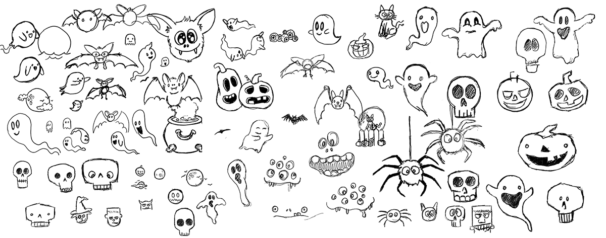
One of the most challenging aspects of building out themed assets was that the elements had to be delightful enough to garner attention, but not be so complicated or flashy that it overshadowed the content. In order to acheive a healthy balance, I always stated with sketches to try and work through shapes and characters hoping for a moment of inspiration so I could move into illustrating and animating. This is a selection of rough sketches from early Halloween takeovers. I was trying to land on assets for the category icon as well as the loader.
Organizing Content Under a Category Icon
The second most visible aspect of a monthly theme was the category icon. It was placed in the navigation bar along with the default icons to have a single point of entry for all the content that would be featured that month. When illustrating and animating these assets I had to be aware of a few caveats. First, the animation space was confined to a specific size becuase of the layout of all other icons, meaning animations couldn't zoom in from an edge or drop from the top. Any solution would have to animate within the confined space. Second, since it is only an icon, illustration needed to be simple enough to be recognizable on a small phone and animation needed to be subdued so as not to be overbearing. Third, the object that made up the icon needed to be easily recognizable to the users who couldn't read the category titles. Before rebrand, these assets were exported as GIFs and then were switched to JSONs after rebrand to allow for more complex illustration and animation capabilities.
Post Rebrand Icon Development
After the rebrand of the YouTube Kids app, we created a concept for icons that would have them start as normal objects, when inactive, and they would transition to some sort of character when they were activated, through a fun little animation. Below is my process from the early sketches, to refinements, illustrations and the finishing with the final animated version. Icons, after the rebrand, were exported using JSONs at 60fps and provided to all the engineering teams as a single vector file that would scale to any size device. This helped us, not only streamline our current workflow, but futureproof the app for when newer, higher-resolution devices were released.
Unique Personalities for Unique Takeovers
My intention for each icon was create a unique animated reveal so that each montly takeover had it's own vibe. Some takeovers were more lively, some were more subdued. It was also important to have the loaders and the icons work together as part of the overall brand and look like they were all part of the same illustration style and theme.
Making Loading Fun Instead of Painful
Everybody hates loading. It's one of the most frustrating things about tech, especially in an area where loading heavy content, like video, takes a very long time. Part of the philosophy I had, as the Motion Lead of YouTube Kids, was making loading fun. When I tackled the problem of loading in the beginning, our brand was maintaining connections to our larger family umbrella through Google's Material Design. The Google Material Design loader was a circle that transitioned from open to close, through it's rotation animation, representing a passage of time. My early approach to loading was to use that circle animation, in combination with some sort of illustrated asset, to tell a small story and reinforce monthly themes. The first ever loader was the top of a bubble blower that almost every child out there is all too familiar with. When themes came around, I always came back to the circle as a starting point and an ending point but incoporated things like a spider, a snowman, sporting goods and other similar elements with delightful results.
Rebranded Loaders and Moving Away from the Circle
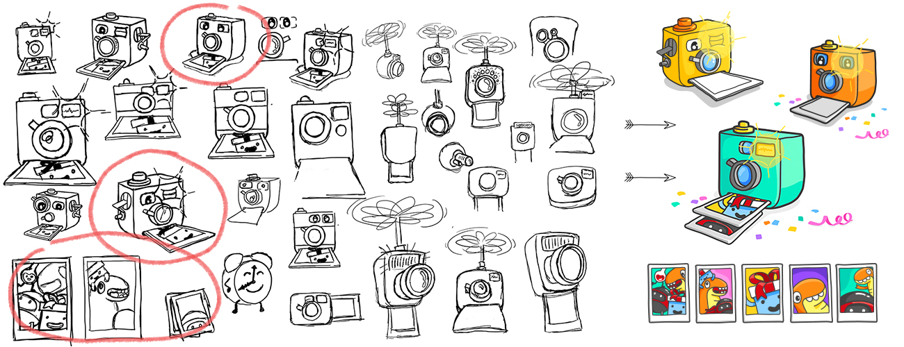
When the rebrand happened, I was looking for a way to bring more life and energy to the loaders. I decided to do away with just using the circle, since the brand we were building in YouTube Kids was a rich world full of fun and funny characters. Using characters as loaders wasn't always successful, so sometimes the process took a meandering path to get results. Below is the brainstorming I did for a holiday loader. Since I could not use any Christmas objects (not everyone celebrates Christmas) or snow objects (It's Summer in some of the major countries that time of year) it was very difficult to find a concept that embraced the feeling of holidays and still was really playful and delightful for the users. I landed on the idea of capturing memories, because that's often a huge part of that time of year, so a camera character was something I worked on a bit. After creating some illustrations, the lonely camera or camera character just wasn't quite working and through some quick thinking I shifted focus to the memories themselves and created a stack of polaroids of some of our favorite cast members.
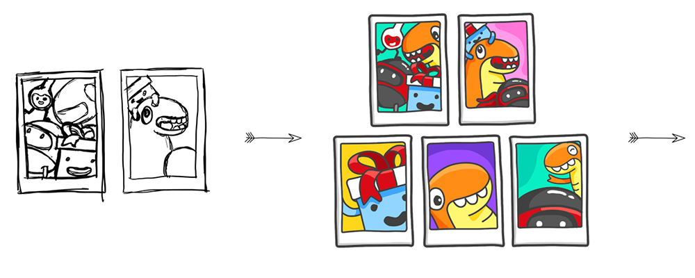
Representing Passage of Time Without Getting Crazy
When working with different thematic versions of the loaders, I was always trying to find a balance between passage of time, storytelling and a somewhat subdued animation. I wanted all this to be fun, but not obnoxious. Below are some examples of how I implemented this approach to different characters and objects. One of the issues that came up during this process was lineart not quite reaching consistency, so the illustration style between, for example, the holiday polaroids and the stack of books doesn't quite line up. The overall approach was so successful we had requests from users that they get a chance to see these animations play, because their content loaded too fast. Something is working if kids wish their content was loading slower!
Audio Branding Was Vital to Completing the Immersion
The first job I was assigned when joining the YouTube Kids team was to build an Audio Brand. I had been in charge of the Audio Brand on the Hangouts team and it was requested of me to take that experience and build something more geared towards a younger audience. After the rebrand, I did not have time to animate the splash screens because the new animation style was extremely difficult and time consuming, but I was still storyboarding concepts and building the audio brand for those elements. Below are some of those splash screens built for their respective themes, as well as the background loops that would play in the main canvas of the app where the kids would land after seeing the opening animation. I speak in length, in another area of my site, about the extensive audio branding efforts and many of the decisions that went into that process. Here are some ways those elements work together to really add polish to the experience of the monthly themes.