YouTube Kids Branding Brainstorm
Designing a Junior Version of the YouTube Logo
During my time with YouTube Kids our team had the exciting task of brainstorming a redesign of the app logo. My goal was to build something that had a connection to the highly recognizable YouTube logo, but was also fun and playful in order to appeal to our younger audience. Everything created was in a very rough, initial brainstorm level of quality. I was casting a wide net to see if anything drew a reaction.

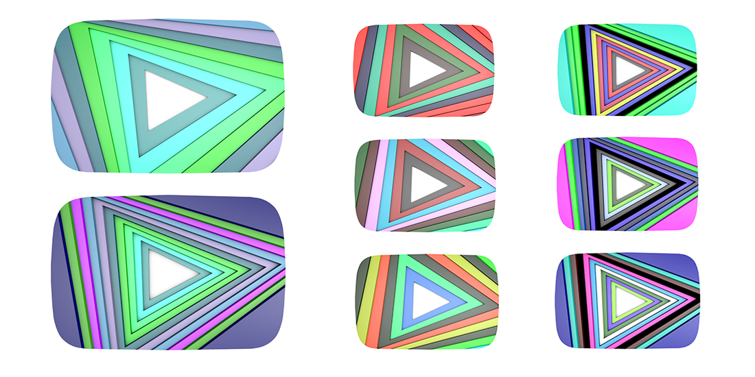
I built these logo variations in Cinema4D to experiment with repeating shapes and cyclical colors. Although I really liked they way they came out, I knew they weren't going to do well, in typical vector branding moments, because of the shading. My proposal was to create vector variations of the same concept with the same colors, but without the shading, to be used in most of the promotional material. This concept was all about just adding flair to the YouTube logomark.
Focusing on YouTube Kids' Crafty Users
Second option I created was a series of hand drawn/painted logos in ProCreate to explore a connection with some of YouTube Kids favorite creators: artists. Quite a few of our users continuously returned to our app for videos on painting, drawing, making crafts, sewing and many similar hobbies. These logos were suppose to represent that 'crafty' side of our user base and create a strong visual distinction from main YouTube. As with the logos above, the biggest challege was figuring out how a hand painted look would be implemented in more traditional branding situations.

A Classical Vector Approach
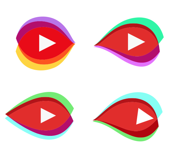
The last direction I took a pass at was the typical vector approach to logo building. I worked with the main YouTube logo as a starting point and then broke off in two directions. The first direction was a combination of eye imagery, to represent watching media, and overlapping wave structures, to represents waves of data being streamed across the internet. The second approach I went with was an attempt to stick closer to the original brand of the main YouTube Logo, but soften the very geometric form of the original button and add in a few colors to make it more playful and appealing to our younger users.


