
Navigating Google Photos
How To Create an Experience That Encompasses High Detail and Numbers
A deceptively difficult task is one that has to account for items that need to be seen up close while maintaining intuitive control over a mass amount of objects that are interactable. Navigating, organizing and modify a large collection of photos is one of those kinds of tasks. Everybody has an opinion on how it should be done and everybody has their own unique way that they want to see it built. When creating a Google Photos desktop app, I was tasked with adding some interaction thoughts to how Motion Design could bring some new levels of interaction in a few select spaces.
Photo Screen Savers: One of the Most Underrated Photo App Features
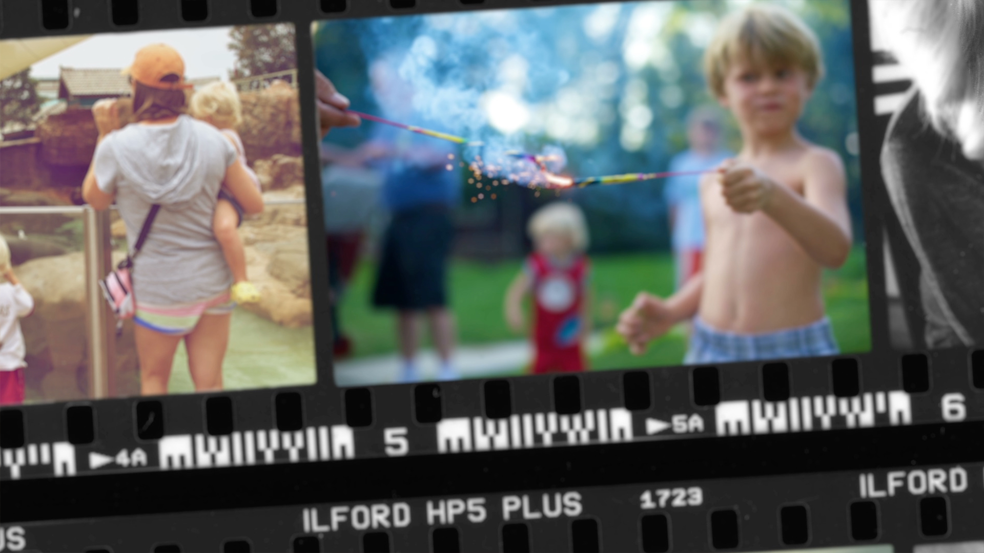
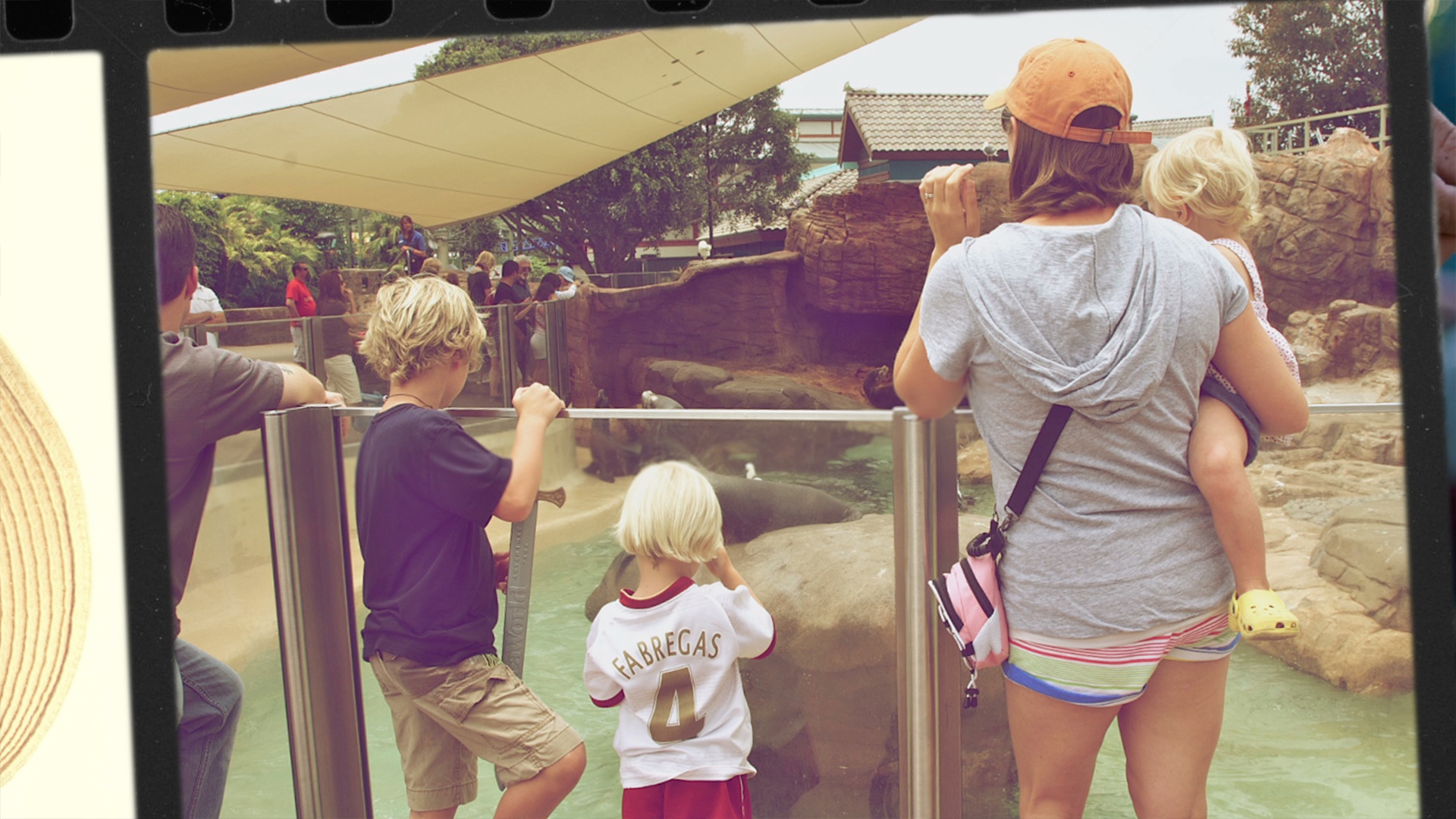
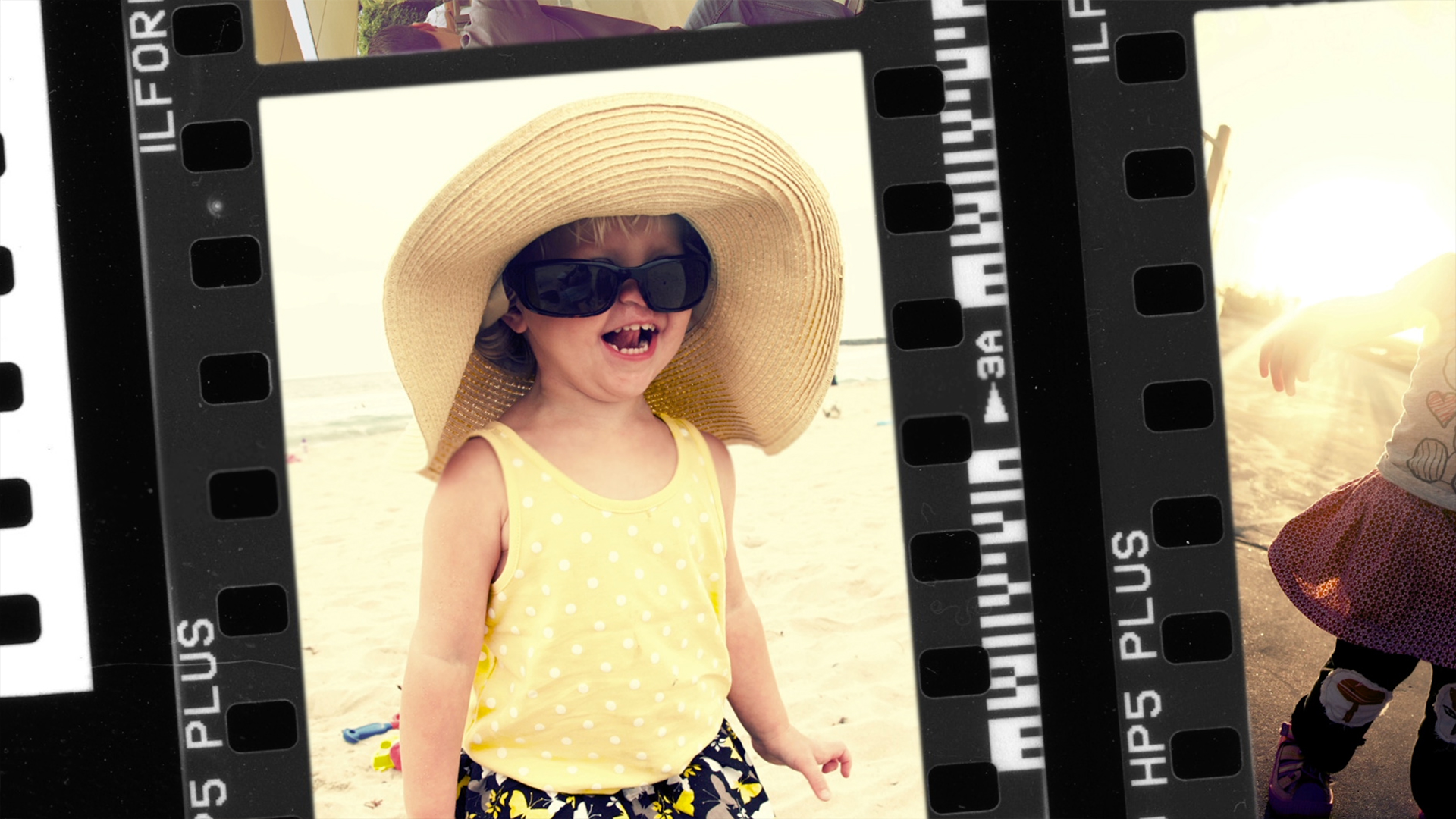
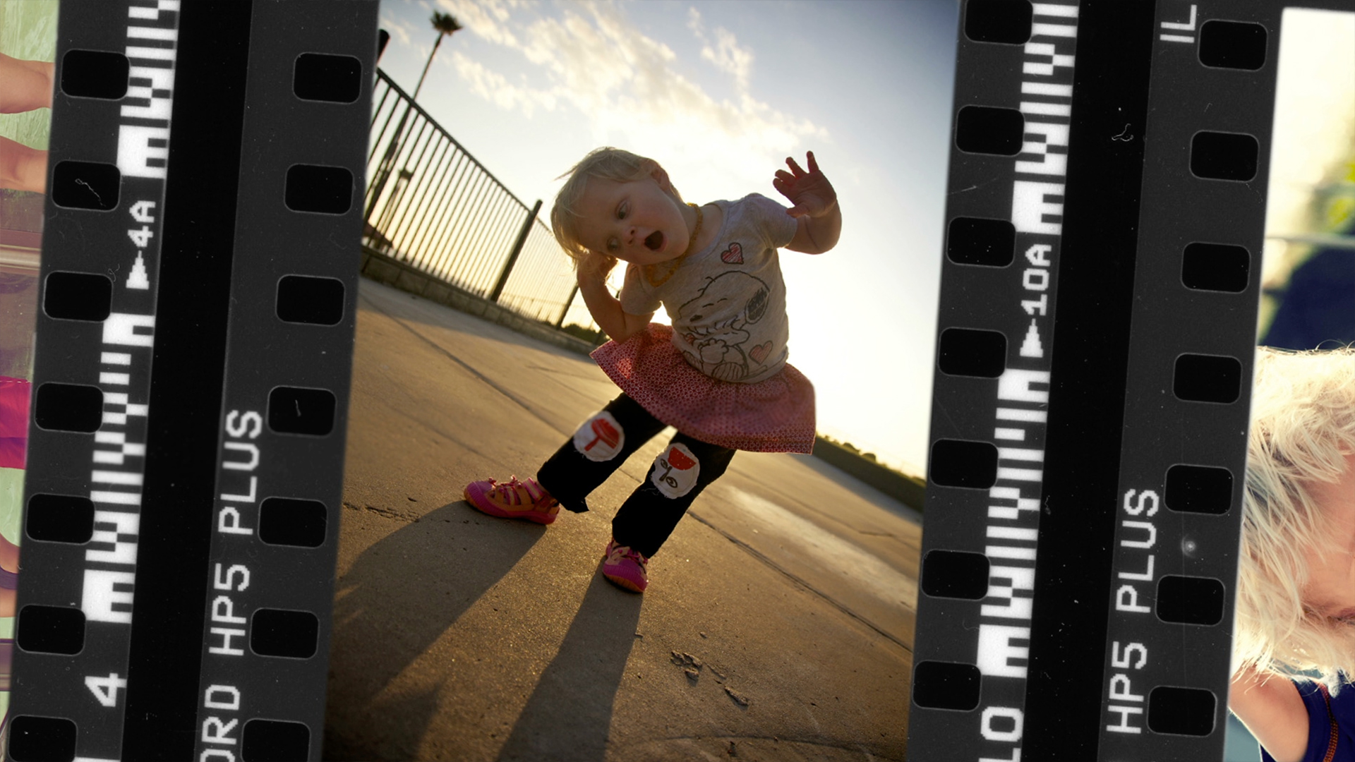
Living in a digital age, almost everyone I know has a very large collection of photos they have taken. These memories are one's they cherish and represent people and places in their lives that are very important to them. One of the biggest User Experience failings is what to do, in a mostly automated manner, to surface these collections for the user allowing them to relive their most precious moments. Apple is one of the few companies that took this seriously and created incredible slide shows for iPhoto, which live on now as OS X screensavers and AppleTV screensavers. Most other tech companies ignore this space and help a user keep a vault of photos with little purpose other than gathering digital dust. Working on the Google Photos app, having worked on brainstorming for the Apple iPhoto screensavers, I created a screensaver experience that took digital photos and put them in filmstrips giving a collection of photos a contact sheet look and then using camera moves and camera blur to zip around the photos, bringing the user on a journey through some of their forgotten memories. The end result was a playful and visually rich display of an event, or period of time, in a user's life.
Macro to Micro With Gestural Interactions
How do you find a needle in a haystack? As a photographer, myself, I have mental connections with what I shot and what it was related to. Since I don't do it professionally, I have that luxury. However, for those who have collection after collection of photos, it's much more difficult to visually represent large collections of photos, navigate them and remember what's in a collection by a single surfaced image representing hundreds of photos. In this exploration of collections and galleries I was experimenting with ideas of how to scroll through a large number of collections, as well as how there could be some 'peeking' interactions so that a user could refresh their memory of what was contained in any given thumbnail. The goal was to give a photographer as much power to skim for the information they were looking for with the least amount of back-and-forth navigation.
Time Adds a 4th Dimension to Interaction
Most UI/UX Designers think primarly in two dimensions. Some of the more unique designers may consider a third dimension, but with the fall of skeumorphic design, that number is less. One thing I have noticed is that those designers rarely understand what it looks like to add a fourth dimenson. If 3D is x,y,z the fourth dimension is adding time. Any interaction can merge multiple UI layouts, if time is considered during the early visual design phases. In the example on the right, I was prototyping an idea about how to navigate a collection of photos by long pressing on a photo and using time to animate out a cluster of it's realted images, then being able to choose another photo from the group. By a simple prototype, one can eliminate a few unnecessary screens and interaction steps that all may require their own specific layout.