The Evolution of a Social Motion Brand
Google+ Social Branch Becomes Stand-Alone Mobile App In Need of a Motion Language
Google Hangouts started as a branch of a bigger Social Media vision. Asynchronous communication was going to be a Social Media killer app, and Google was to be leading the charge. It was to be a key element that would draw users into daily activities in the Google+ world. As the endless possibilities for expansion in this space became apparent, the creation of a chat experience went from a tool within the Google+ ecosystem to a vision for a mobile experience spanning platforms and devices. Thus, Google Hangouts was to leave the nest and became a product with its own dedicated teams. With an imminant launch, I became the lead for evolving a Motion Brand through it's growth.
A Mobile App Launch Screen is Where it All Began
One of the first tasks I tackled when I joined Google+ was creating a splash screen that could play at the launch of the app. Any mobile app would need a short period of time to load resources and build the UI. Inevitably, this would create a slight pause after the initial launch. One of the research projects that was really popular amongst multiple teams around Google was one on loading and how it impacts users. The overview was that if a loading experience was fun, it felt faster for a user than if it was boring or there wasn't one in place. This was the philosophy I was starting from, on day one, working on motion experiences within the Google mobile space. Find areas to add delight, make waiting more enjoyable, ehance exeperiences for the user, add new ways to interact that were more direct and intuitive. These were foundational for how I was to move forward in building the Hangouts Motion Brand.
A Simple 3 Dots That Echoed Around the Technosphere
One of the earliest animated assets I created, in Hangouts, was for 3 dots designed to show a user that someone was in the process of sending a message. As I started concepting some motion for this, one of the more obvious solutions was to create a cascading pulse of the dots that moved away from the avatar. This motion pattern reminded me of sending data down an invisible pipe, a strong visual for bits of information traveling down internet wires. This was not some stroke of genius, this was a pretty straightforward visual story, distilled down to simplicity. Funny enough, this pattern grew way beyond my expectations. This same pulse has been taken, and reused, by almost every major Big Tech entity out there and has become a pretty standard animated visual for a waiting state where data is in the process of being transferred.
Expanding 2D Functionality into a 4th Dimension, Starting With the Chat List
The first area where I spent a significant amount of time was the chat list. From a Motion Brand perspective, the desire is to get as much mileage out of an animated interaction as I could. Motion was not very easy to code, so only the most navigated sections of an app were prioritized. Interactions like a new message incoming, clearing out an old chat, entering a conversation or starting a new message were areas of focus early on in the explorations.
Adding Flair and Breaking Bounds
As the Motion Brand evolved, I began experimenting with more advanced transitions and interactions that would bring more energy to the app. With any addition of animated assets, the apprehension is always in overdoing it and having the motion overshadow the experience. Good motion can improve the feeling of an experience without drawing too much attention, bad motion can be just a distraction.
Interactive Motion Stories: Great for Vision, Terrible for Engineering
Depending on who the motion pieces are being presented to, the way it's getting presented has very different impact. If the group I am presenting to are creatives, directors, managers or stakeholders there is a great benefit to 'vision videos' or long interaction stories that take the viewer through an idealistic journey of how the app would work if there were no limitations in implentation or time. This is a great way to secure resources for what is needed to ship these experiences. Engineering teams, however, may enjoy these, to an extent, but they can be incredibly overwhelming when they are trying to break down how to actually bring the motion into executable code.
Piece by Piece Motion Elements Easier for Engineering to Digest
Taking apart a 'vision video' and breaking it down into smaller pieces is the best avenue for delivering assets to an Engineering Team. They need to plan on how they are going to manipulate code, install libraries, dive deeper into APIs, build custom transitions to bring a tangible reality to motion concepts. Without this direction, it can be hard to figure out what pieces are the most impactful, which area to start in, how to build a flexible series of elements, which functions or libraries need to be created so as to have a modular toolbox in place in order to avoid having to hand code every little thing. This was also especially important as the iPad version of the app was being given a lot of attention, dividing an already small development team into multiple mobile directions with their own implementation challenges.
Designing Powerful Features to Bring Delight to Users
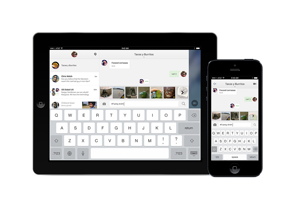
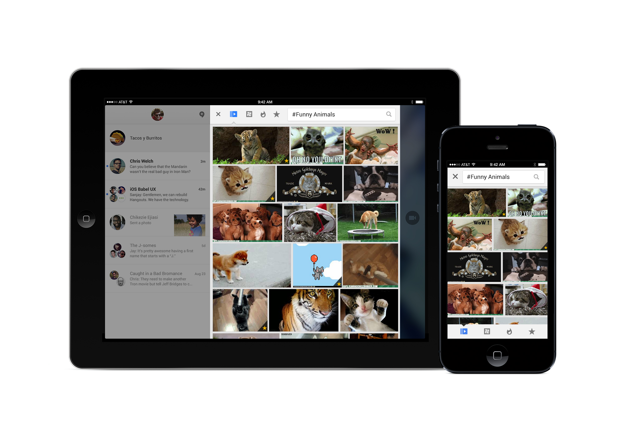
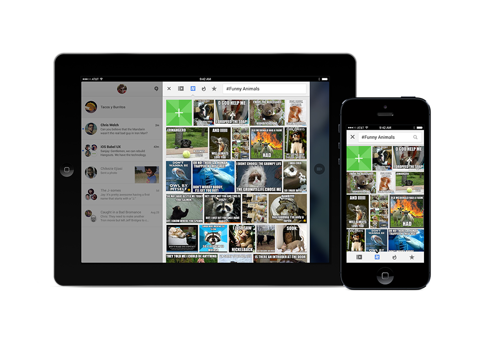
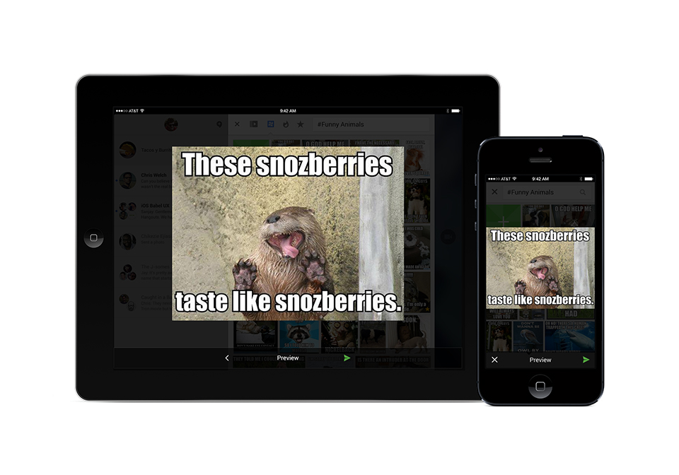
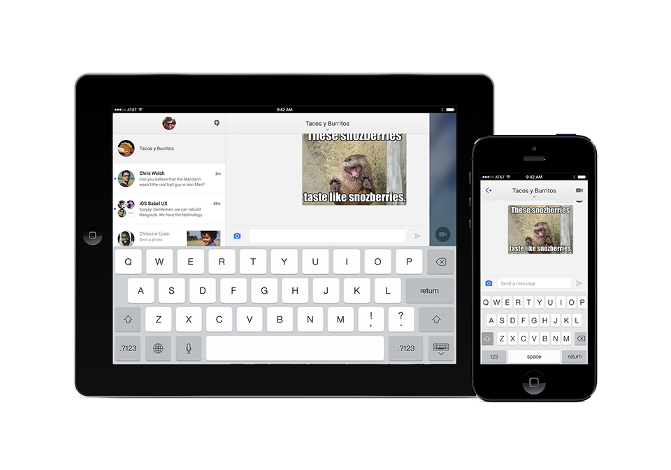
Although most of my experience on Hangouts was building out a Motion Brand, a few times I got a chance to join the other Visual Designers in sprints or brainstorming to figure out new features and new designs. The concept, below, was one I created during a sprint where we were trying to figure out some more delightful and powerful features to add to Hangouts. This was one of my most exciting features, and one of the saddest. The point of the feature was to be able to type a '#' into the chat bar and some descriptors after it and it would bring up memes and gifs based on those chosen words. The Tech Lead of the Engineering Team loved this one so much that he had his team build a quick prototype of the feature to try and sell it to stakeholders. I am not sure where it was rejected, but it never made it to production. The sad part was that this design was years ahead of any other chat program trying to put memes or gifs in their experience, and now, every single app has it as part of their default feature set. Sigh.
Extending Motion Brand to Desktop, Convergence vs Divergence
One of the most difficult challenges in building a Motion Brand for Hangouts was the ever expanding landscape of experiences being planned for the app. Not only was there already a mobile app for phones and tablets, which had to be built for iOS and Android, and a web experience being built within Google+, but there was also the introduction of the desktop app, which had to be built for Mac and PC. Although new arenas were great for building out fresh interactions and accompanying motion, being able to keep consistent UI and experiences across such a wide field made the quality control very daunting.
Product Design Decisions and Their Motion Brand Consequences
With the introduction of the desktop app, there was a push to separate the chatlist from the chat windows. I had been working towards an experience where the chat windows and its individual chats were seamlessly interacting with each other. This was no easy task and required engineering buy-in and investment. Now that the desktop app was going to break that connection, all the Motion Design that had been already concepted, finalized, planned and had resources allocated for would not be able to apply to this newer product. These kind of Product Design decisions, although unsurprising, often cause a lot of issues with consistency, expectations and quality of the user experiences.
Delight is Last Considered
Motion Design is much easier to conceptualize than it is to implement. Coding something into a mobile experience takes time and resources, far more than making cool things in After Effects. Because of this reality, there are so few times in a typical mobile app development process to build something just for the fun of it. One of the concepts I worked on was this funny little interaction within the chat to just mess with your friends in the group. There was really no purpose here other than a delightful little sparring amongst friends. Did this get coded and implemented? No. Was it funny and fun to create? For sure.
Emerging Technology in Dire Need of Intuitive Gestural Motion
As Hangouts matured, one of the areas that Product Leads wanted to invest a lot of energy into was the video chat side of things. This area was so important because nobody else was doing it. Peer to peer video was a thing, but large group chats, all using video, was pretty unattainable in almost all products. Because this tech was so revolutionary, I put a lot of intention on how to use gestural interactions and Motion Design to create a fluid and powerful experience that was focused less on tapping a button, in specific areas, to make things happen. I also worked a lot on having visual cues happening around the space to indicate to participants what was going on, especially when people could dip in and out, so there wasn't a lot of unexpected interactions.
Exploring Simple Interaction Variations
Keeping the same philosophy of fewer button taps to do everything (which required more UI space for more buttons) I explored a lot of options around how to directly manipulate visual elements that allowed the user to customize their experience to their desired outcome. Here is an example of modifying an interaction in subtle ways to see which was more impactful to the desired outcome. A lot of successful Motion Design is found in the small variations between different ways of acheiving the same results.
Customizing the Main Stage for Flexibility
As video chat became a bigger deal and a more comfortable way of communication with users, being able to account for a wider variety of setups was really important to an enjoyable experience. Because Hangouts could be on a phone, tablet or computer and with computers have video cameras in a myriad of locations, it became really important to explore a way of manipulating the strip of videos displaying the participants in the group. Instead of being able to put that design element anywhere on the screen, I built out an interaction where there was drop zones around the screen that a user could move to if it was in the way for them. This kind of flexibility becomes really important the bigger a mobile experience gets and using Motion Design can create much more satisfying solutions than only UI can do.
Motion Brand Comes Full Circle
After a lot of work and a lot of progress from that original Google+ Splash Screen, it was time to come back to that part that started it all and build some fun animations for the Hangouts video calling experience. One of the Visual Designers had come up with these cool little character devices and I took those, with some fun smiley bubbles and translated them into a few open animations that were playful, delightful and gave some startup time for launching a video call.
An Animated Intro and a New UI
With any mobile product, constant evolution comes with the territory. Funny enough, it can become frustration to users because as they get use to where everything is, Visual Designers start to move elements around. Although my preferred intro animations weren't the ones chosen and the direction was much more subdued, they were part of building out the new Hangouts calling experience. Hangouts was reaching the refinement phase where Motion Brand was becoming more concise and more intentional. This is the phase in which attention starts turning towards building specs, being consistent and trimming the fat.
Elegant Controls With Flair
The maturing of the Hangouts mobile experience meant a more elegant approach to how the app was designed and a naturally more cinematic way in the which the video was being displayed. Visual Design flourishes were being abandoned and a more minimalist approach was being implemented. When mobile design goes this route, Motion Design is utilized in different ways. Instead of bolder and more intrusive moves, there are smaller movements with more refinement. Here the movement of the video strip as well as the small animated buttons are the focus of the story to elevate the product experience. Even within a small space, there's still room to have a little fun. The slashing through the icons was a small touch that relays an important functionality, even within a confined space.
Maturity Doesn't Mean Boring
Although I was working with a maturing look and evolving the Motion Brand along the same path, it didn't mean I was no longer able to explore some more fun interactions. One of the biggest issues with a growing Motion Brand is if it stops a person from exploring ideas outside the more predictable avenues. In these examples, I was using animation to expand on the information to a user or hint at a possible interaction for them to participate in. The beauty of Motion Design is being able to build beyond the bounds of a typical UI and help the user get to new places without having to add more screens to file through.
Onboarding Can Be Fun
I have mentioned an idea in the YouTube onboarding breakdown and I will reinforce it here: onboarding is one of the more unpleasant mobile experiences to design and build. There are so many ways to go about it, there's often way too much information to cover and legal wants it to contain a manual of text. However, even with those hurdles, it can still be a place to inject some fun to make the experience less painful. Working with a talented Illustrator, I was able to take some colorful assets and build out this motion experience as one last nod to user delight before I moved on to other things.