Apple iPad Attract Loops
Drawing Apple Store Visitors into Product Tours Quietly
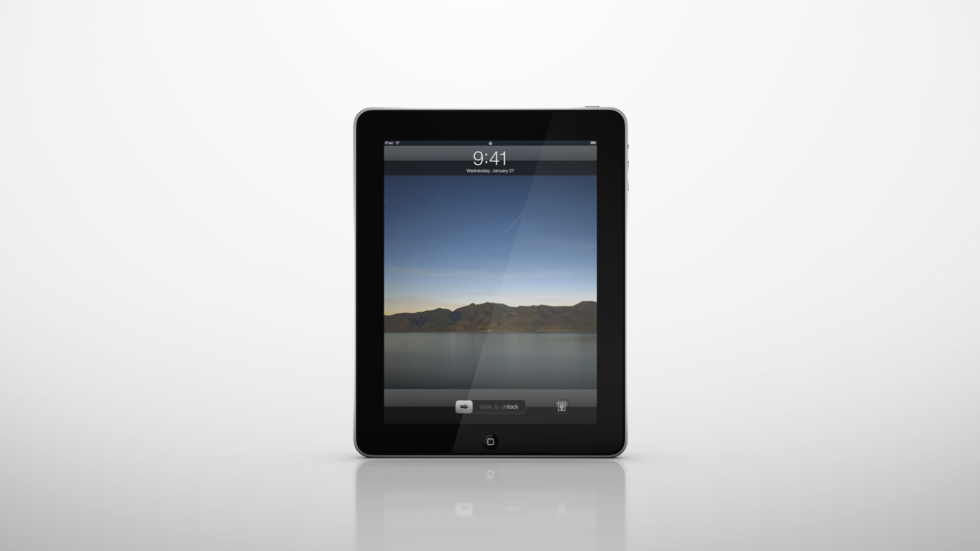
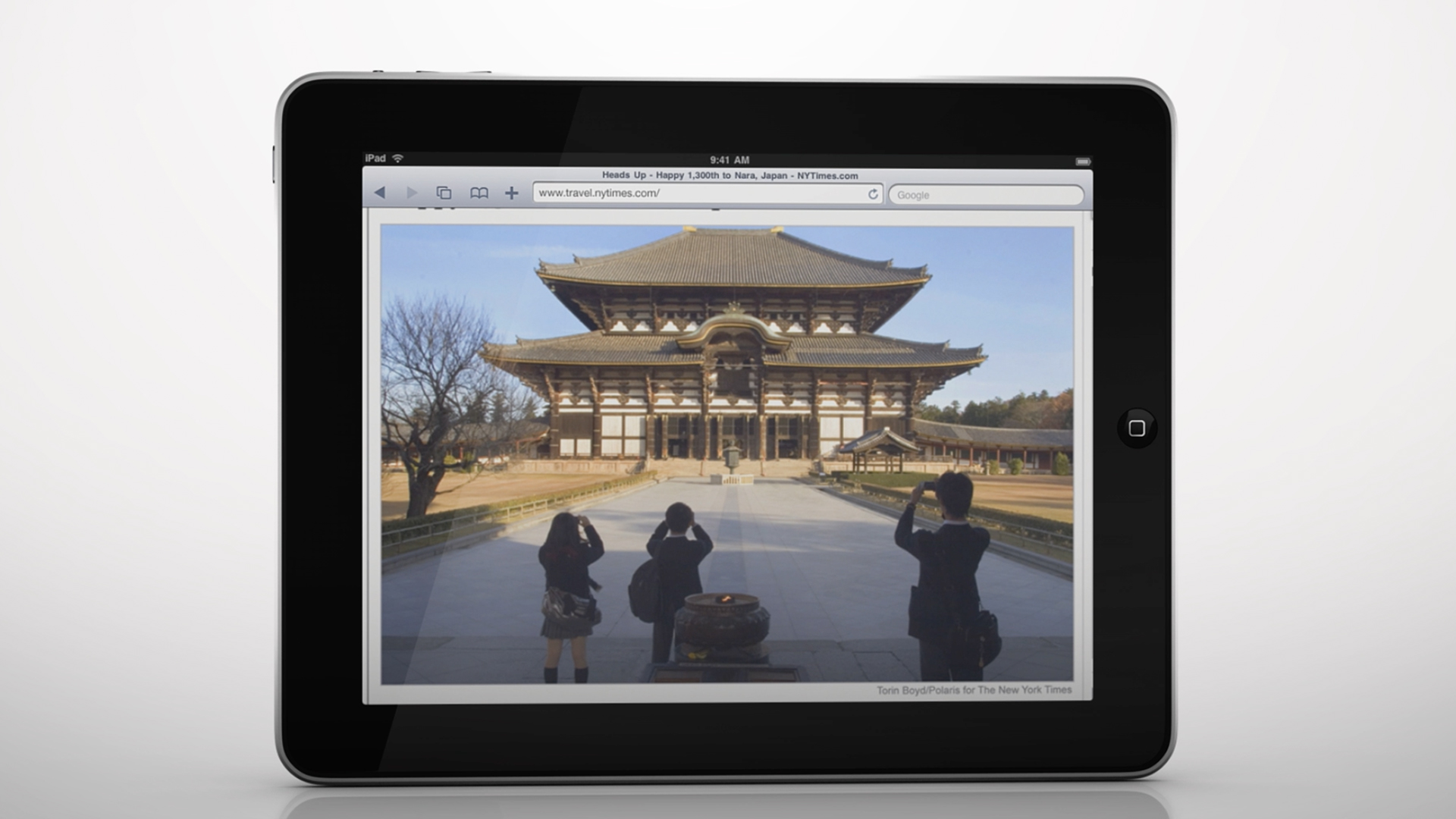
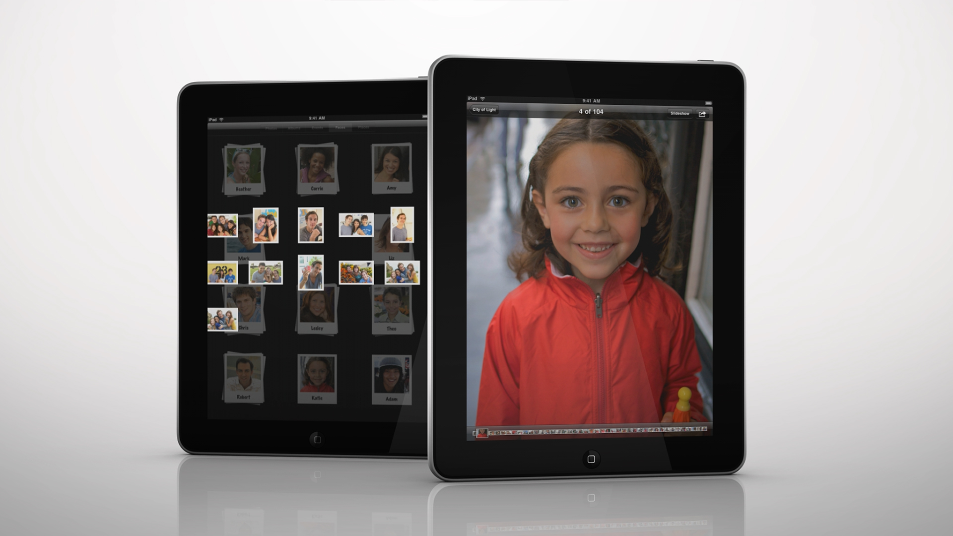
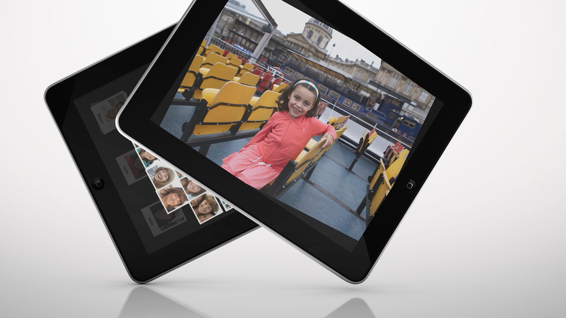
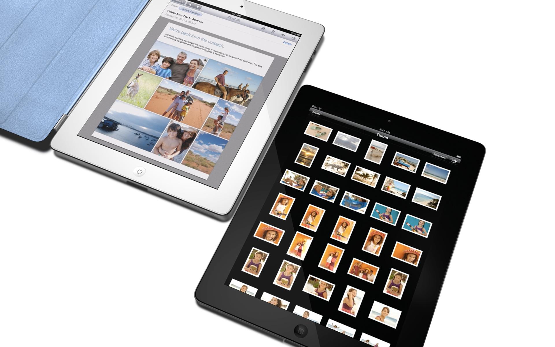
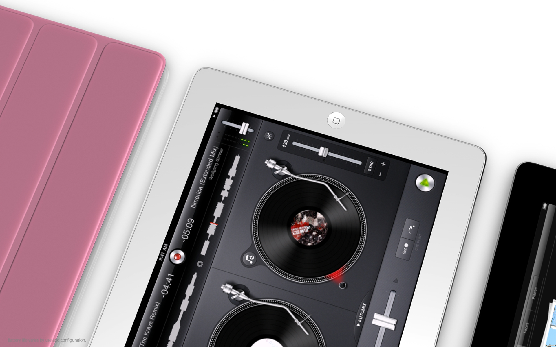
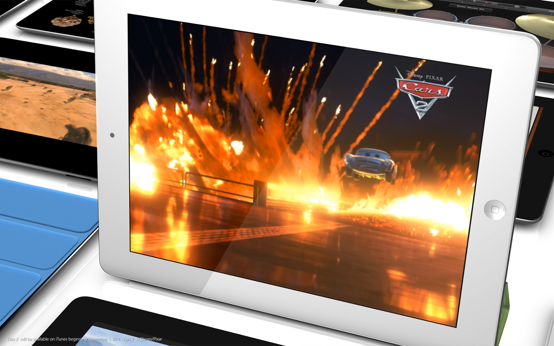
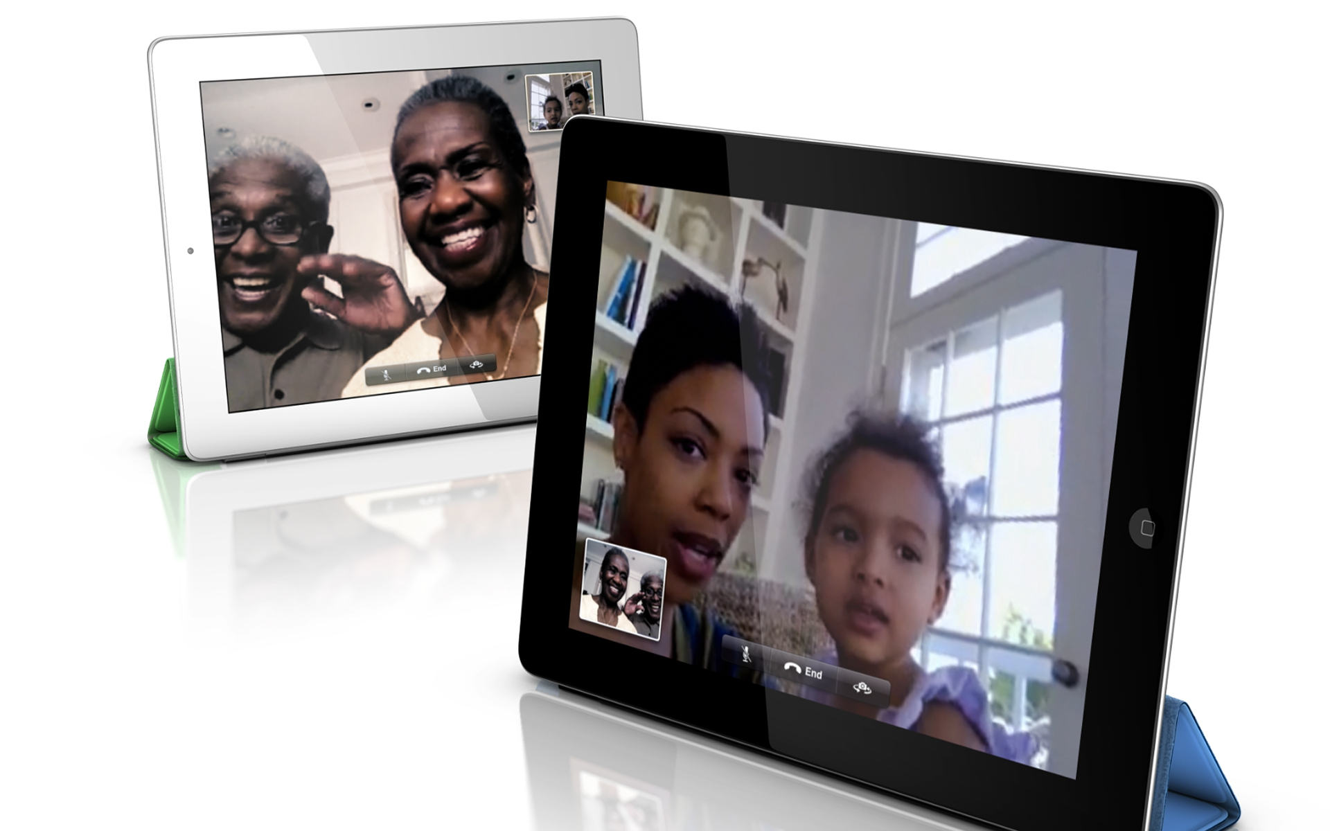
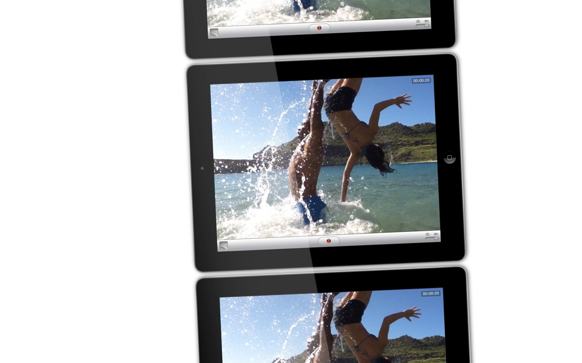
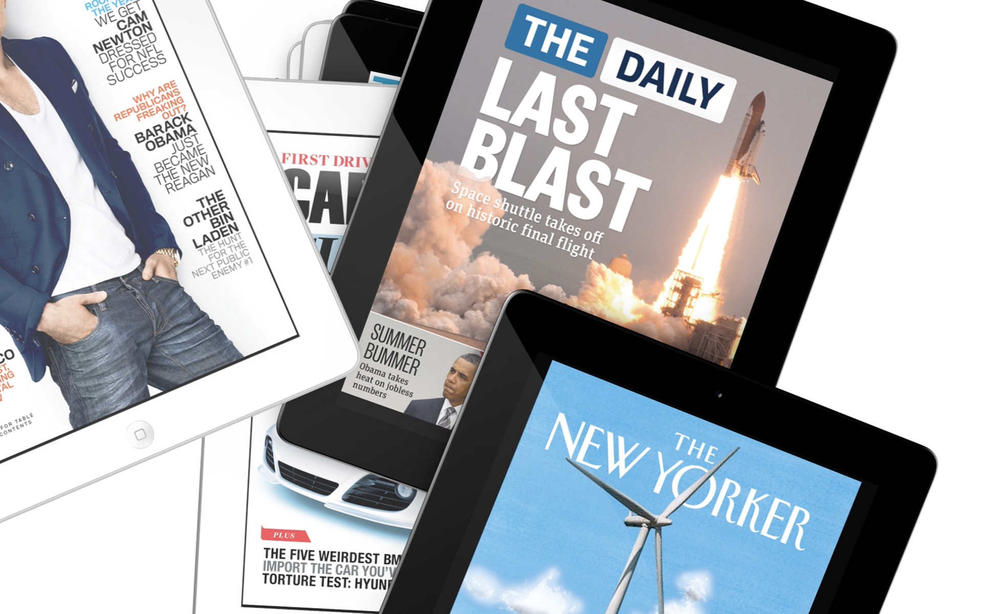
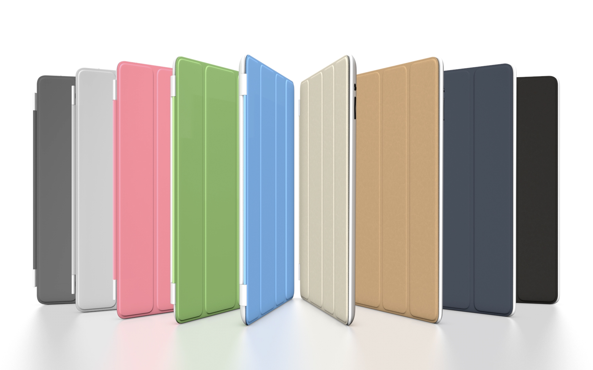
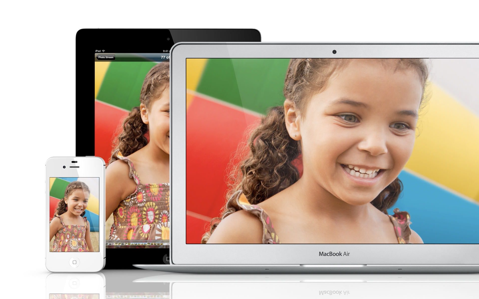
The vast majority of all loops created for Apple were to be displayed on their own devices in Apple Stores around the world. It was a more rare occasion to get something that was to be displayed on a TV or in another retail space (which were almost always TVs as well). Because these were to be on smaller devices, their creation encompassed a few important caveats. First, most visuals were strictly about the products they were on and maybe some of their Apple-made accessories. Second, the type need to be simple, graphic and terse. People were going to be glancing from a distance, wordy copy would have been pointless. Third, the majority of the energy was in the way the cameras moved, the way the textures and environments were built and in subtle beauty of the composition of the products. This was the epitomy of 3D Product Visualization and we were setting standards that are still followed today. My favorite bits in this loop were the iPads used as a filmstrip for the video part and the iPads used as a stack of magazines. Unique metaphors to catch attention of already distracted viewers.
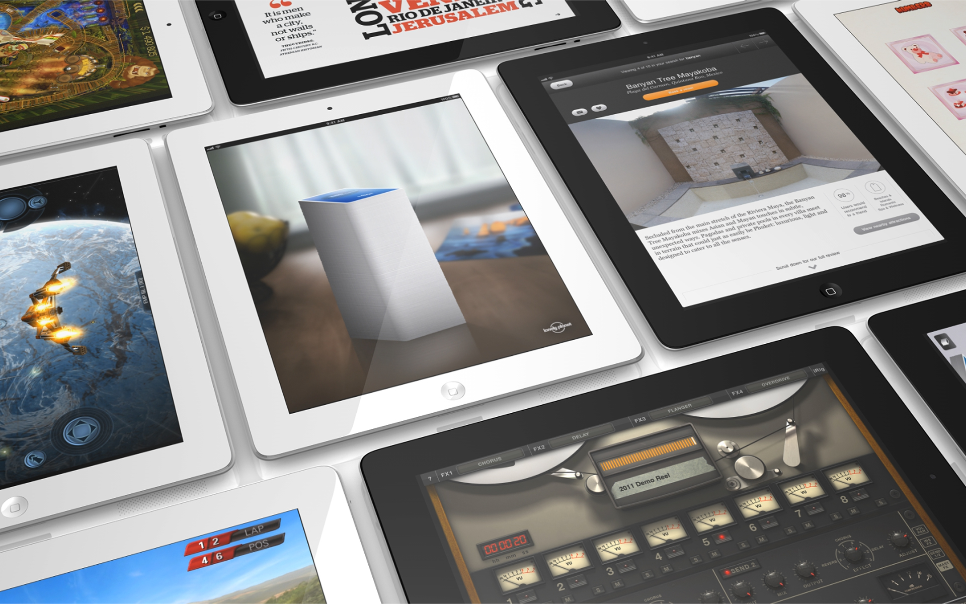
Elevating the Apple Brand by Going from 2.5D to 3D
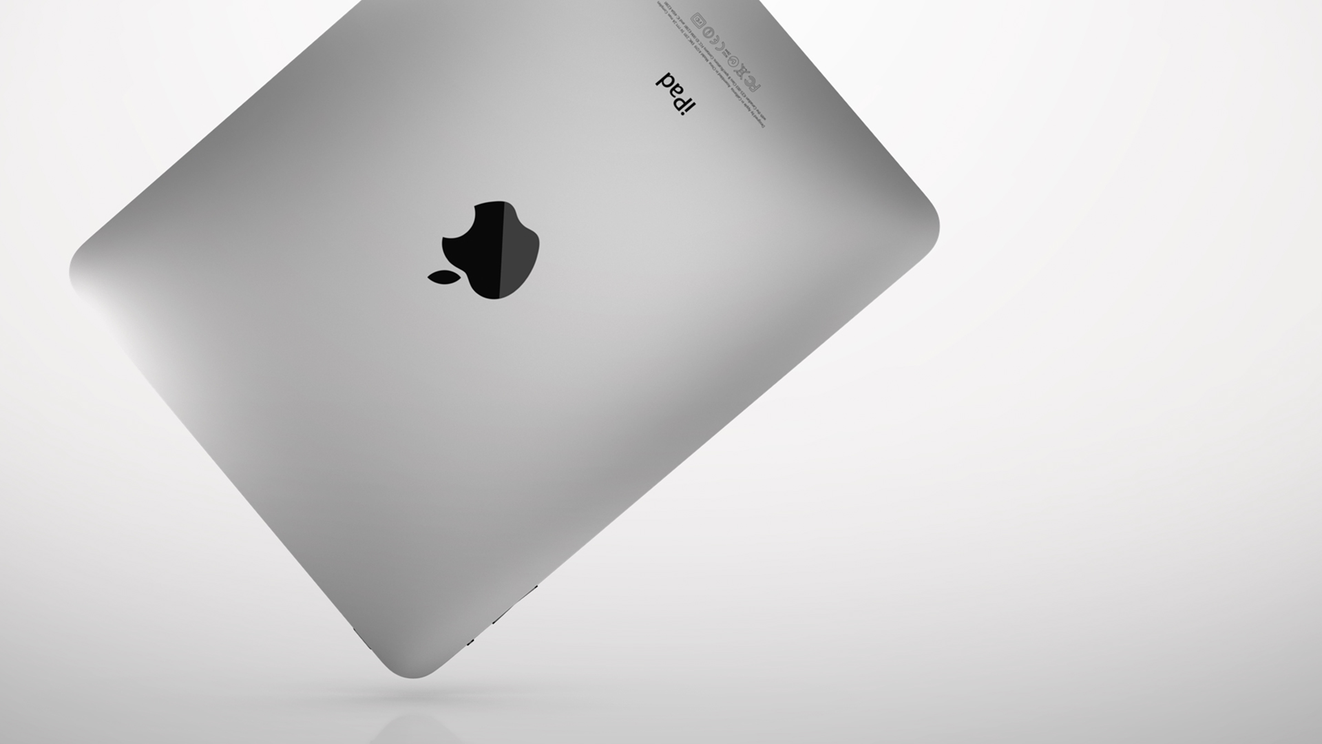
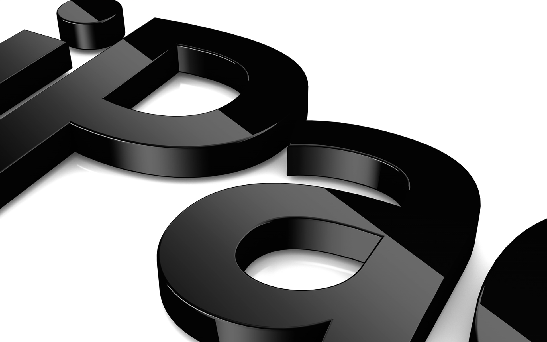
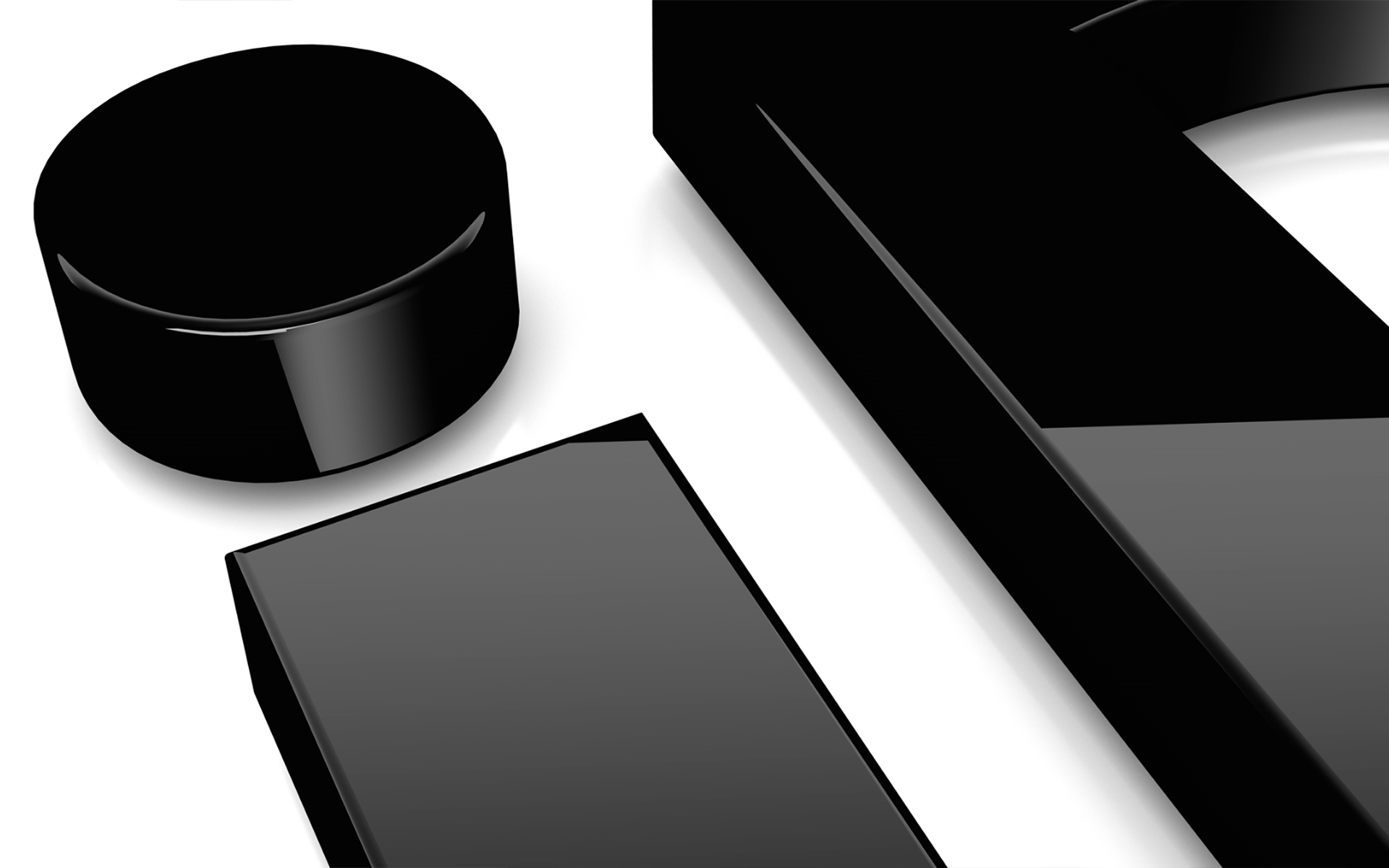
Earlier versions of loops were even more straightforward, no accessories, no colors, not even 3D type. Most of the energy came out of a few unique camera moves and a few more aggressive flips or spins of the devices, themselves. Before I arrived at Apple and taught my team about Cinema 4D, these loops were created with 2.5D rigs in After Effects. Once I got people comfortable in 3D, we began to perfect difficult issues like speckled aluminum, the right amount of reflection, separate render layers and super clean composites in AE with diminished floor reflections, screen reflections and UI captures. We were creating near photorealstic renders without RedShift, Octane, Arnold or any other render engine built specifically for realistic textures and lighting.
